Let’s be honest – your website should be your hardest-working employee. It should attract leads, build trust, and convert visitors into clients. But if it’s not doing that, something’s off.
We see this all the time with startups, nonprofits, and small businesses: your website looks “fine,” but it’s quietly turning people away. If your site isn’t converting, here are 5 common mistakes that might be the culprit – and more importantly, what you can do about them.
1. Confusing Navigation
Ever landed on a website and instantly felt like you needed a map? That’s a red flag. If your navigation is cluttered, disorganized, or overloaded with too many options, visitors will get overwhelmed and bounce before they even explore what you offer.
Good navigation is about clarity and hierarchy. Visitors should immediately understand where to go next without thinking too hard.
🔧 Fix it: Stick to a simple, streamlined menu – 4 to 6 top-level items max. Group related pages under dropdowns and label them using terms people actually understand (not “synergistic solutions” or “integrated frameworks”). And always have a clear path to contact or convert. Keep it clean, logical, and laser-focused on the user journey.
2. No Clear Call to Action (CTA)
Here’s a tough truth: people won’t act unless you tell them what to do. You might have the best services or mission in the world, but if your CTA is weak or nonexistent, you’re making it hard for people to take the next step.
We see way too many sites that bury their CTA below the fold, use vague phrases like “Learn More,” or worse – don’t have one at all. No matter how sleek your design is, if users don’t know what to do next, you’re losing them.
🔧 Fix it: Make your CTA obvious, specific, and bold. Think “Book a Consultation,” “Join the Movement,” or “Get a Free Quote.” Repeat it throughout key areas of your site – homepage, service pages, blog posts. People need reminders, and they need them to be clear and direct.
3. Outdated or Inconsistent Branding
Your branding isn’t just your logo – it’s the feeling people get when they land on your site. If your visuals are outdated, your tone is inconsistent, or your brand identity doesn’t match your current mission, you’re sending mixed signals.
People judge quickly. If your site looks like it hasn’t been touched since 2012, it undermines your credibility. And if your colors, fonts, and photos aren’t cohesive, it creates friction that erodes trust.
🔧 Fix it: Reevaluate your branding and make sure everything, from your imagery to your messaging, feels cohesive, modern, and intentional. Your website should look and feel like you, just on your best day.
4. Not Optimized for Mobile
This one’s big. Over half of all web traffic is mobile – and even more in younger or multicultural audiences. If your site isn’t mobile-friendly, it’s a dealbreaker.
A slow-loading homepage, tiny unreadable text, or buttons that are hard to tap are all signs your mobile experience needs work. And trust us, people won’t pinch-and-zoom their way through it – they’ll just close the tab.
🔧 Fix it: Use responsive design principles to ensure your layout, fonts, and images adjust beautifully to different screen sizes. Test everything on actual mobile devices – not just the preview window. Prioritize speed, readability, and tap-friendly elements. Your site should feel just as intuitive and polished on a phone as it does on a laptop.
5. Too Much Text, Not Enough Story
We get it – you have a lot to say. But long walls of text? They don’t convert. People don’t read websites the way they read books – they scan. And if they can’t find what matters to them quickly, they’ll move on.
What’s worse is when a site is technically accurate but emotionally flat. No story, no soul. Just buzzwords and bland paragraphs. That doesn’t build connection – it builds yawns.
🔧 Fix it: Break up your text with headings, bullet points, and visuals. But more importantly, lead with story and emotion. Show your audience that you get them. Speak to their struggles and aspirations. And yes – add some personality. The goal is to make people feel like they’re talking to a real human, not reading a brochure.
So, what now?
If your website is guilty of one (or more) of these mistakes, don’t beat yourself up. This isn’t about perfection – it’s about progress. Small changes can lead to big wins, especially when they’re focused on clarity, connection, and conversion.
At Radiate Consulting Digital, we help businesses and nonprofits build websites that don’t just look good – they work hard. Let’s make your site your best salesperson (and maybe your coolest team member, too?)
Ready to turn your website into a client-winning machine?
📩 We’d love to hear from you.
Reach out to our team for a quick, friendly chat about how we can help. Whether you’re curious about a full redesign or just need a second opinion, we’re here to make it easy – and worth your time.
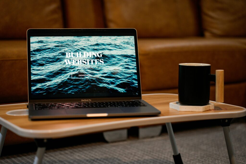
Photo by Carriza Maiquez on Unsplash